Responsive web design effectively resizes or reconfigures a web page so that it fits the screen of the device you are using. So, if you are visiting a website from a smartphone, iPhone, Android, laptop or iPad, for example, the page reconfigures so that it is easy to read on that device.
But why is responsive web design so important?
There are plenty of reasons why a responsive web design is so important. To begin with, adults from the USA spend approximately 34 hours a month browsing the internet from the comfort of their smartphones, while 51% of emails are now checked on a mobile device. Within an hour of browsing a website, 70% of mobile users will take action, whereas for those websites that are not optimised for mobile phone use, 40% of users will choose an alternative action, such as exiting the email and visiting a competitor site.
This is not just the case in the USA; millions of people from across the globe are tapping in to their portable devices to access the internet, instead of using a home computer.
When you view a website that is not optimised, it means that you have to zoom in and scroll side to side to find what you are looking for. This takes time and effort, which makes the user feel frustrated. As such, before too long he or she will close that website, which automatically results in a lost customer and therefore, a lost sale. For this reason, it is paramount that your website is responsive and fully optimised.
How to Optimise your Email Marketing Campaigns
Creating a responsive web design for your email marketing campaigns is incredibly easy and there are countless template editors that allow you to do this with ease.
When creating an email marketing campaign, for example, you can use a specific email template that automatically provides a responsive design. This ensures that your campaign will display successfully on a variety of devices.
Before sending out your email campaign you can review how it is going to look from various devices by clicking on the relevant option.
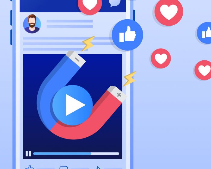
A responsive email marketing campaign will:
- Condense the content to fit the screen of the device being used
- Clearly present all images, graphics and videos
- Allow the user to flip the screen horizontally and view the email from this angle
Above all else, everything works smoothly and easily for a seamless viewing experience.
A responsive email and web design is absolutely critical in today’s mobile-heavy era. If you haven’t yet optimised your website or emails, be sure to do so without delay!
To learn more about 8 Ways Media’s responsive email and web design services please contact us.
Related articles.