Responsive web design is a style of design that responds to any device it is on – be it desktop, mobile phone, tablet, iPad or iPhone – in fact, just about any mobile.
When you look at an email, newsletter or website from your mobile phone, if it’s being sent in a non-responsive design or layout, it is incredibly frustrating as you have to scroll left and right and zoom in to get a better view.
Responsive designs are therefore adaptive and responsive. They are adaptive because they are designed with multiple fixed-width layouts and they are responsive as they have multiple fluid grid layouts.
Why Go Responsive?
As technology continues to evolve it has never been more necessary to go responsive, as new and exciting devices enter our environment and people become more and more technically savvy.
Today, the majority of internet users are browsing from a mobile device, so it’s critical that you have a responsive web design. Otherwise, you can pretty much guarantee that people will quickly exit from your site and never return again. High-quality web design has therefore never been more crucial in maintaining audience interest and enticing them back for more.
There are countless tools available that can help you to build a responsive website freely and easily, however you can also call upon the help of a professional agency, like 8 Ways Media, who specialise in professional, customised and responsive web designs that are also SEO friendly.
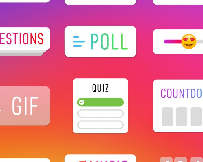
Almost every business out there is going responsive, incorporating modern features such as parallax scrolling into their web design in order to create an appealing website that keeps people browsing for longer.
Factors to Consider Before Going Responsive
- Time and money
- Old browsers
- Quality of content
- Website vs. web app
- The design and development process
- Site performance
Best Practices to Adopt when Going Responsive
Perform a thorough content check to ensure all content is well written with perfect spelling, grammar and punctuation.
Start off small and work your way up, focusing on being responsive on a mobile device first before progressing to tablets and other larger devices.
Don’t think of a responsive web design as a completed project: always optimise your site, including your landing pages, your marketing content and your homepage. This will enable you to make a continuous difference to the quality of your site and above all else, your bottom line.
Related articles.


